
Teaching data science and machine learning with Blockly DS
An instructor guide for STEM and non-STEM undergraduates with Blockly-DS
Use visual blocks to make the sequence of an analysis visible: load data, inspect it, ask a question, choose an appropriate method, and explain the evidence. This handout builds on Luiz Barboza’s Blockly DS work to provide a classroom sequence with demonstrations, practice tasks, and assessment guidance.
What students should be able to do
- Load a CSV into a data frame and distinguish rows, columns, numeric values, and categories.
- Select, filter, group, and summarize data; select a chart that answers a stated question.
- Identify features and a target, train a supervised model, and evaluate predictions on held-out data.
- Compare classifiers and explain why training performance alone is insufficient.
- Use K-means to explore groups and communicate uncertainty, limitations, and responsible uses.
Suggested teaching sequence
| Meeting | Focus | Evidence of learning |
|---|---|---|
| 1 · 75 min | Load, inspect, select, filter | Annotated data table and filtering explanation |
| 2 · 75 min | Group, summarize, visualize | Summary table and justified chart |
| 3 · 75 min | Descriptive statistics | Distribution interpretation |
| 4 · 75 min | Linear regression | Predictions and held-out evaluation |
| 5 · 75 min | Classification and metrics | Labeled confusion matrix |
| 6 · 75 min | KNN, Naive Bayes, trees | Fair comparison of three models |
| 7 · 75 min | Neural networks and clustering | Architecture and cluster interpretation |
| 8 · 75 min | Project presentations | Reproducible analysis and limitations |
Prepare the classroom and load data
Before students arrive
Provide the course’s working Blockly DS link or configured environment, the CSV files, and a short data dictionary. Test the same browser and environment students will use, including the Play control and local file access. Keep a local copy of each CSV in case a web link fails. Use synthetic or de-identified records.
Demonstrate the first workflow
- Open Data Analytics and drag the data frame read block into the workspace. Insert the CSV URL into its path input. Use a direct CSV resource, not a webpage that merely displays a file.
- Open Data Visualization and attach the data frame output to Table View. Follow the compatible connection sockets; do not leave the read block disconnected.
- Press Play. Point to a row as one observation and a column as one variable. Check headers, record count, decimal notation, missing entries, and units.
- Repeat using the Open File component in Data Analytics. Use its file icon to select a local CSV and display it with Table View.
- Show the third option: construct a data frame from a dictionary whose keys are column names and whose values are equal length lists. Use three rows so students can predict the output before running.

Teacher prompt
“What does one row represent? Which columns are measurements? What would happen if one list in the dictionary had fewer values?” Ask students to explain the table before adding another block.
Support and extension
More support: Supply a completed loading workspace and ask students to change only the source. Pair a driver with a navigator and switch roles.
Further challenge: Compare a numeric column with a number stored as text. Explain why the displayed values can look similar but behave differently.
Check for understanding
Each student displays a table and writes its observation unit, two column meanings, and one quality check. Do not accept a successful run alone as evidence of understanding.
Select and filter records
Demonstrate with the student grades example
- Load the grades CSV and attach Table View. Identify the numeric final grade and the letter score; these are different fields. Copy column names exactly from the table.
- Attach the head operation and enter 3 to inspect the first three rows. Replace it with tail to inspect the final rows. Explain that head is not a selection of the highest grades.
- Use the column selection block to select the numeric grade. Then select the letter score. If the block permits additional fields, select both and compare the output shape.
- Use the row filter operation with the numeric grade column, the greater than comparison, and 7. Send the result to Table View and press Play.
- Change the condition to include a boundary value if your installation provides a greater than or equal comparison. Explain which students with grade exactly 7 are retained. Keep the original dataset available.
Guided practice
Use the small practice dataset in Practice data and troubleshooting. Ask students to predict how many rows satisfy Grade > 7 before running the blocks. Then select Course and Grade from the filtered result. Have pairs compare the full table, filtered table, and selected columns.
| Operation | Question it answers | Common mistake |
|---|---|---|
| Head or tail | What do the first or last records look like? | Treating first rows as the highest values |
| Select columns | Which variables do I need? | Assuming other rows are removed |
| Filter rows | Which observations meet a condition? | Comparing a numeric threshold to a letter score |
Explain the block logic
Conceptual sequence: read data frame → filter Grade > 7 → select Course and Grade → Table View. This is pseudocode, not an exact block layout. The filter changes the set of observations; column selection changes which attributes are shown.
Support and extension
More support: Give students one condition at a time and a printed table to mark by hand before using blocks.
Further challenge: Compare filtering before grouping with filtering after aggregation. Explain why “students above 7” differs from “courses with a mean above 7.”
Check for understanding
Expected practice result: four records have Grade > 7. A grade of exactly 7 is excluded. Ask students to justify the boundary rule rather than merely report four.
Debugging cue
If the output is empty, check the exact column name, the comparison operator, and whether values are numeric. An empty table can be a valid result; it is not automatically a program failure.
Group and summarize data
Connect to a familiar spreadsheet operation
Start with an Excel pivot table, then build the equivalent analysis in Blockly DS. Ask students what belongs in the grouping field and what belongs in the calculation field. A category defines the groups; a numeric measurement supports a mean.
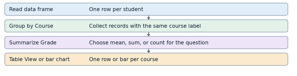
- Read the grades CSV and inspect it with Table View. Identify Course as the category and Grade as the numeric field.
- In Data Analytics, apply Group by to Course. Explain that the records are now partitioned into groups.
- Apply the summary operation to Grade and choose mean. Display the output with Table View. Verify one group’s mean by hand.
- Change the operation to count and compare the meaning of the new result. Count on a column may omit missing values; verify the block’s behavior before interpreting it as the number of students.
- Restore mean and retain the grouped summary for a bar chart. Make clear that a chart of mean grades is not a chart of course enrollment.
Classroom task and expected answer
With the eight-row practice dataset, the course means are Business 7.0, Biology 8.0, and History 6.5. Counts are 3, 3, and 2. Ask why the mean of those three course means differs from the mean of all eight student grades: the courses have different numbers of students.
Support and extension
More support: Use colored marks on a printed table to group rows before calculating. Link each resulting summary row to the original records.
Further challenge: Calculate a weighted average from course means and counts, then compare it with the overall mean. Discuss how missing grades alter denominators.
Check for understanding
Students state the observation unit before and after grouping, name the aggregation function, and explain why a sum of grades usually answers a different question from a mean.
Choose and explain visualizations
| Chart | Teaching use | Required interpretation |
|---|---|---|
| Line | Values across ordered time points | Change over time, with time on x |
| Bar | Compare categories or group summaries | Which category is larger and by how much |
| Pie | A small set of nonoverlapping parts of a whole | What each share represents |
| Histogram | Distribution of a numeric variable | Counts within numeric intervals |
| Box plot | Median, quartiles, spread, unusual values | Distribution rather than individual records |
| Scatter | Relationship between two numeric variables | Direction, form, and unusual observations |
Demonstrate two complete chart choices
- For a time series, read the CSV and inspect its date and measurement columns. Choose Line graph in Data Visualization. Connect the data and specify the relevant series using the inputs available in the installed version. Sort dates chronologically and check whether values are daily or cumulative.
- Use the layout settings to supply a descriptive title and axis labels. Include units and distinguish country series when several lines are displayed.
- For category comparisons, use the Course mean Grade summary from the previous lesson. Connect the summary to Bar graph and verify that each bar is one course mean.
- For proportions, replace mean with count and use a pie chart only when the groups form the intended whole. Explain why mean grades are not enrollment shares. A bar chart is also a valid, often easier to compare alternative.
Teach interpretation before decoration
Ask: “What claim can this chart support? What can it not establish?” A time trend or a scatter pattern does not demonstrate causation. A count comparison may reflect different group sizes. Historical COVID examples are teaching data, not current public health evidence.
Support and extension
More support: Provide a question and two candidate chart types. Require a one sentence choice before students build the chart.
Further challenge: Compare raw counts with normalized rates or percentages when an appropriate denominator is available. Explain how a changed axis range affects perception.
Check for understanding
Students submit one chart with units, a defensible title, two observations, and a limitation. Reject unlabeled charts even when the blocks run successfully.
Teach descriptive statistics
- Load the grade data and select the letter Score column. Use the frequency operation and connect its result to Print. Ask students to verify a category count manually.
- Select the numeric Grade column and use the quartile or descriptive summary operation. Identify minimum, first quartile, median, third quartile, and maximum; keep mean separate from median.
- Connect the numeric grades to a boxplot in Data Visualization. Locate the middle 50 percent between the first and third quartiles. Check the implementation’s whisker convention.
- Build a Histogram for the same numeric grades. Identify what each interval contains and how the bin choices change the appearance.
- Compare mean and median. Ask students to reason about an unusually low or high observation without automatically removing it.
Clarifications to teach explicitly
Skew is named for the direction of the long tail. A concentration of high values with a tail toward low values is left skew, not right skew. Do not infer skew merely from which side has the tallest bars.
A box plot’s whiskers do not always represent the minimum and maximum. A common convention extends them to the most extreme observations within 1.5 interquartile ranges of the box; observations beyond are plotted separately. Check the rendered chart and its settings. Different quartile algorithms can also yield slightly different values in a small dataset.
Short worked check
For grades 4, 6, 6, 7, 8, 8, 9, 10, the mean is 7.25, and the median is 7.5. Ask students to calculate both. If an extreme score changes, the mean usually changes more strongly than the median.
Support and extension
More support: Start with eight sorted values on paper. Mark the two middle values and count categories before using the blocks.
Further challenge: Compare two reasonable bin widths and two documented quartile conventions. Explain why the underlying data did not change when the visual summary changed.
Check for understanding
Exit question: “A plot has many high values and a long tail toward low values. Which direction is the skew, and why?” Expected answer: left, because the tail points toward smaller values.
Teaching boundary
These blocks support descriptive exploration. A visually large difference is not by itself evidence of statistical significance. Avoid adding a significance claim unless the study design and an appropriate inferential method support it.
Teach linear regression
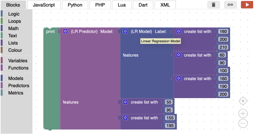
- Load the training CSV. Identify the first two exam columns as features and the third exam as the target. Inspect their numeric types and units. Use the actual column names from the file.
- Make a scatter plot of Exam 2 against Exam 3, then Exam 1 against Exam 3. Ask students to describe direction, unusual values, and why the relationship may change in another cohort.
- From Models, choose Linear regression. Connect the training target to the label input and the first two exam columns to the feature inputs. Use the gear to add inputs if needed.
- Connect the model output to Score and Print to inspect training fit. Label this value training R-squared.
- From Predictions, choose the matching Linear regression predictor. Connect the trained model and the first two exam columns from the separate test CSV. Keep the feature order the same.
- Print the predictions. Connect them and the actual test Exam 3 values to the R-squared metric, checking the expected versus predicted scores. Report this separately from the training score.

Interpretation and methodological additions
R-squared measures performance relative to predicting the mean of the evaluation targets. A value of 1 indicates perfect predictions; 0 matches that baseline in squared error; negative values are possible. It is not “percent correct” and is not restricted to 0–1. For nonconstant targets, explain it as 1 − residual squared error / total squared variation.
This example illustrates score prediction, but a classroom model should not replace a student’s actual assessment. Use the exercise to discuss uncertainty, changes between cohorts, and consequences of errors. Add mean absolute error in grade units as an extension using a verified block or a separate notebook.
Support and extension
More support: Provide separate, clearly named training and test files and a partially wired model.
Further challenge: Inspect residuals and compare with a mean prediction baseline. Explain why extrapolating outside the observed grade range is risky.
Check for understanding
Students identify which records trained the model and which evaluated it. A high training score is insufficient without a separate test result.
Teach logistic regression and evaluation
Choose a suitable classroom example
Avoid examples that predict a binary gender label from height and weight. Use synthetic object sorting or a documented flower dataset for student practice. Body measurements do not establish a person’s gender identity.
- Load separate training and test files with the same features and target coding. For a binary task, define Class 1 as the positive class and Class 0 as the negative class before evaluating.
- Choose Logistic Regression from Models. Connect training labels and training feature columns; exclude the target and identifiers from the features.
- Use Score and Print for training accuracy. Then connect the trained model to the matching predictor with test features in the same order.
- Compare the predicted labels with true test labels using Accuracy and Confusion matrix. Check socket labels carefully: swapping inputs may transpose the matrix and change precision and recall.
- Add Precision and Recall and explain the error each metric emphasizes. For more than two classes, verify the tool’s averaging settings rather than assuming binary formulas apply.
Work through one unambiguous example
Use actual labels [0, 1] and predictions [0, 0]. With rows as actual labels and columns as predictions, the matrix is:
| Actual label | Predicted 0 | Predicted 1 |
|---|---|---|
| 0 | 1 true negative | 0 false positives |
| 1 | 1 false negative | 0 true positives |
Accuracy = (TP + TN) / all observations = 1/2 = 0.50. Recall = TP / (TP + FN) = 0/1 = 0. Precision = TP / (TP + FP) = 0/0, which is undefined here; a library may return 0 with a warning. Explain that convention rather than saying the mathematical value is necessarily zero.
Why two test examples are insufficient
One changed prediction moves accuracy by 50 percentage points. A perfect score on two rows is a demonstration of block wiring, not reliable evidence of generalization. Use a larger, representative held out set for the project and report class counts. Compare against a majority class baseline.
Support and extension
More support: Have students place example predictions into a paper confusion matrix before building the metric blocks.
Further challenge: Explain threshold tradeoffs when probabilities and thresholds are exposed by the installed implementation.
Check for understanding
Ask which is more costly in the chosen scenario: a false positive or a false negative. Students must justify the metric they prioritize.
Compare KNN and Naive Bayes
K nearest neighbors
KNN classifies a new observation using nearby training examples. The number of neighbors is a model choice; proximity depends on the feature representation and scale.
- Rebuild the classification pipeline using KNN in Models. Connect the same training features and labels used in the previous lesson.
- Set the neighbor count to 3. Ensure there are at least three training observations.
- Connect the KNN predictor to the trained model and the same held-out test feature columns. Print predictions and calculate the same metrics.
- For an instructor extension, compare k = 1, 3, and 5 using validation data or cross-validation within the training portion. Choose k before inspecting the final test result. An odd k can reduce binary voting ties, but it does not eliminate every possible tie.
Naive Bayes
Naive Bayes combines class probabilities with feature evidence under a conditional independence assumption. “Naive” describes this modeling assumption; it does not mean the method is always poor. Verify that the selected block is appropriate for the feature types.
- Choose Naive Bayes in Models and connect the same training label and feature columns.
- Use the matching predictor with the unchanged test feature set. Compare predicted labels with the correct test target.
- Record accuracy, positive class precision and recall, and the confusion matrix. Keep the sample counts alongside the metrics.
- Ask students to explain a difference in predictions in terms of model assumptions rather than simply naming a winner.
Scaling and fair comparison
Features measured on larger numerical scales can dominate KNN distances. If scaling is available, estimate its parameters on training data and apply the same transformation to validation and test data. If this installation has no suitable block, provide consistently preprocessed files and explain how they were prepared.
Support and extension
More support: Keep the CSV files, positive class, feature order, and evaluation blocks unchanged while swapping the model and predictor pair.
Further challenge: Compare a scale-sensitive distance method with the selected Naive Bayes variant and document its distributional assumptions.
Check for understanding
Students submit a comparison with dataset sizes and one reason that perfect results on a very small test set do not establish that a method is generally superior.
Teach decision trees
- Read the training CSV. Choose Decision Tree from Models and connect the target to the label input and the selected numeric columns to the feature inputs.
- Set the maximum depth. Start with a small depth such as 3. Explain depth as a limit on successive splits along a path. It is not determined directly by the number of features.
- Display the training Score. Connect the model to the Decision tree predictor and the separate test features, using the same columns and order.
- Print the predictions and compute held-out accuracy and a confusion matrix. Verify the expected target column and that each selected input is correct.
- Compare a shallow and a deeper tree using validation data. Record both training and validation performance before selecting the final setting.
Make the decisions visible
Ask students to describe a hypothetical sorting rule in plain language, such as “If length is at most 5, check width; otherwise check another measurement.” Label this as a hand-constructed example, not a learned rule. If the installation exposes an actual tree visualization or export, inspect it.

Teacher discussion
A deeper tree may fit training exceptions closely and perform worse on new observations. A shallow tree may miss useful structure. Reusing a feature at different nodes is allowed; having two features does not imply that a depth of two is sufficient. A readable rule can still reflect an unrepresentative sample or a misleading feature.
Support and extension
More support: Let pairs sort a small set of object cards by one measurement at a time. Require them to describe the same rule consistently.
Further challenge: Compare depth 1, 2, and 3 with the same validation split. Explain a training–validation gap and how pruning or regularization could address it.
Check for understanding
Students explain one complete path in their own conceptual tree and state why interpretability does not guarantee correctness or fairness.
Teach neural networks
Build the architecture before running it
Consider a network with two inputs and three hidden layers containing 3, 4, and 2 nodes. The list [3, 4, 2] specifies three layers, not three training observations or nine layers. It contains nine hidden units in total. The input dimensions match the features; the output representation depends on the classifier implementation and target encoding.
- Choose the neural network model and connect the training target and features. Keep the same task used for the other classifiers.
- Attach a list to the hidden layers input and enter 3, 4, and 2. Sketch three hidden layers with the corresponding numbers of units.
- Inspect the training Score, then connect the matching neural network predictor to the model and held-out features.
- Print predicted labels and compute the same test metrics used for the other classifiers. Distinguish convergence or optimization problems from a wiring error.
- As an extension, compare one small hidden layer with the three-layer configuration using training and validation data. Check scaling, iteration settings, and warnings if those controls are exposed. Do not promise that adding units will improve performance.
Explain what the blocks hide
A dense network connects units in one layer to units in the next. Training adjusts weights to reduce an objective. Hidden units learn combinations of features; they are not additional records. A single output unit is common in binary classification, but “one output for each pair of classes” is not a general rule for neural network design.
Keep the experiment interpretable
Use a small table to record architecture, available training settings, random seed if exposed, validation metric, and warnings. Change one choice at a time. If repeated runs vary, discuss randomness and retain the settings needed to reproduce a run. Small classroom examples are not a benchmark proving that a neural network outperforms simpler models.
Support and extension
More support: Give students [3, 4, 2] and ask them to draw and count hidden layers and units before touching the tool.
Further challenge: Explain why feature scaling and convergence matter, and compare predictive benefit with computational cost and interpretability.
Check for understanding
Students must distinguish feature count, training record count, hidden layer count, and hidden unit count. Reuse the correctly labeled confusion matrix conventions from Teach logistic regression and evaluation.
Expected conceptual answer
With two input measurements and hidden layers [3, 4, 2], there are two input dimensions, three hidden layers, and nine hidden units. The list alone doesn’t specify sample size, output activation, the number of training iterations, or the model’s final quality.
Explore groups with K-means
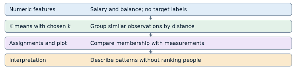
- Load the salary and balance example and inspect the two numeric columns. Define the measurement units and period. Use synthetic data for practice.
- Create a Scatter plot with Salary on x and Balance on y. Ask students to describe apparent concentrations before fitting any model.
- Choose K-means. Connect Salary and Balance as features and set the number of clusters to 5. There is no target label input in this task.
- Connect the cluster assignment output to Print. Compare each assignment with the corresponding data row; keep row order unchanged.
- Repeat with a different cluster count as an exploratory extension. Explain that changing k changes the question imposed on the data; do not select a value only because a picture looks appealing.
Interpret carefully
A cluster labeled 0 is not inherently better or worse than a cluster labeled 4. Labels may be permuted across runs, and random initialization can change assignments. Compare membership patterns rather than the numeric names alone. With distance-based methods, scale can strongly affect the result; document any scaling and the features used.
Balance is sometimes described as saving ability. Teach a narrower interpretation: an observed balance is not proof of saving skill, behavior, or financial responsibility. It may reflect debt, expenses, household circumstances, timing, or missing context. Describe “higher recorded balance” instead of assigning personal qualities.
Support and extension
More support: Use two-dimensional scatter plots and have students circle possible groups before fitting K-means.
Further challenge: If a verified tool or companion notebook supports it, compare inertia, silhouette values, and stability. Explain why no single metric proves the clusters are meaningful.
Check for understanding
Ask: “Why is classification accuracy not the default score here?” Expected answer: no known target classes were supplied; evaluate structure, stability, and usefulness for the stated question instead.
Run and assess an undergraduate project
A repeatable lesson routine
Use a 75 minute pattern: 10 minutes to introduce a domain question, 10 to predict output, 15 for a narrated demonstration, 25 for pair practice, 10 for interpretation, and 5 for an individual exit response. Students should explain the data entering and leaving each block rather than copy an entire workspace at once.
Project brief for students
Choose a question about a non-sensitive dataset with a clear observation unit. Produce a data audit, a grouped summary, two justified visualizations, and a supervised model comparison. Add a clustering exploration when it fits the question. Your conclusion must explain what the evidence supports, what remains uncertain, and how another person can reproduce the analysis.
- Document the data source, units, target, intended prediction time, missing values, duplicates, and excluded fields. Remove identifiers and variables that reveal the outcome.
- Create training, validation, and final test partitions before fitting transformations. For repeated people, sites, or time-ordered records, use an appropriate group or time split instead of a naive row shuffle.
- Learn imputation, encoding, and scaling from training data only. These preparation steps are methodological additions; use verified blocks, an instructor-prepared workflow, or a companion notebook where needed.
- Compare at least three appropriate models on the same validation protocol. Keep the final test set untouched until choices are fixed. Report a simple baseline and class counts or target range.
- Submit the workspace or available export, input data or reproducible source, settings, labeled outputs, and a short interpretation. Include screenshots of students’ own work where the course environment permits.
| Criterion | Points | Evidence |
|---|---|---|
| Question and data understanding | 20 | Clear purpose, observation unit, units, and audit |
| Block workflow and reproducibility | 20 | Coherent connections, files, settings, and saved outputs |
| Evaluation quality | 25 | Separate data, baseline, correct metrics, no leakage |
| Interpretation and limitations | 25 | Explains errors, uncertainty, and appropriate use |
| Communication and visual clarity | 10 | Readable charts and concise evidence based conclusion |
Equitable differentiation
Keep the rubric common. Offer a prepared dataset and partially completed workspace to novices. Invite extensions such as Python equivalence, cross validation, residual analysis, or sensitivity to scaling for experienced students. Supply written block sequences and high contrast charts; check keyboard and assistive technology support in the actual deployment rather than assuming it from Blockly generally.
Practice data and troubleshooting
A small dataset for the first three lessons
Instructor created synthetic records. Enter as a dictionary or save as a CSV with headers ID, Course, Grade, Score. These eight records support hand checking; they are too small for meaningful model evaluation. Score is derived from Grade and must not be used to predict Grade in a genuine forecasting task.
| ID | Course | Grade | Score |
|---|---|---|---|
| S1 | Business | 8 | B |
| S2 | Business | 6 | D |
| S3 | Business | 7 | C |
| S4 | Biology | 10 | A |
| S5 | Biology | 8 | B |
| S6 | Biology | 6 | D |
| S7 | History | 9 | A |
| S8 | History | 4 | F |
Answer checks: Grade > 7 retains S1, S4, S5, and S7. Course means are Business 7.0, Biology 8.0, History 6.5. The overall mean is 7.25. The sorted numerical example in Teach descriptive statistics uses these same values.
Common problems and teacher responses
| Symptom | First checks |
|---|---|
| CSV will not load | Check direct file URL, permissions, connection, and delimiter; try the prepared local copy. |
| Table looks wrong | Check header row, delimiter, numeric types, and decimal conventions. |
| Block will not connect | Check the expected input type: data frame, column, list, model, or numeric value. |
| Column is missing | Copy the exact name; check capitalization, spaces, and whether a prior selection removed it. |
| Prediction has a shape error | Use the same feature count and order as training; keep the target out of test features. |
| Unexpectedly perfect score | Check leakage, repeated records, evaluation on training data, and very small test size. |
| Precision warning | Check whether the model predicted any positive examples and how zero denominators are handled. |
| Outputs vary across runs | Check random initialization, split settings, and whether the workflow refits the model. |